Reconnect. Reminisce. Remember. Rebrand.
Client
Columbia Law School
Studio
Freelance
My role
Branding
Art direction
Email design
Print design
Project management
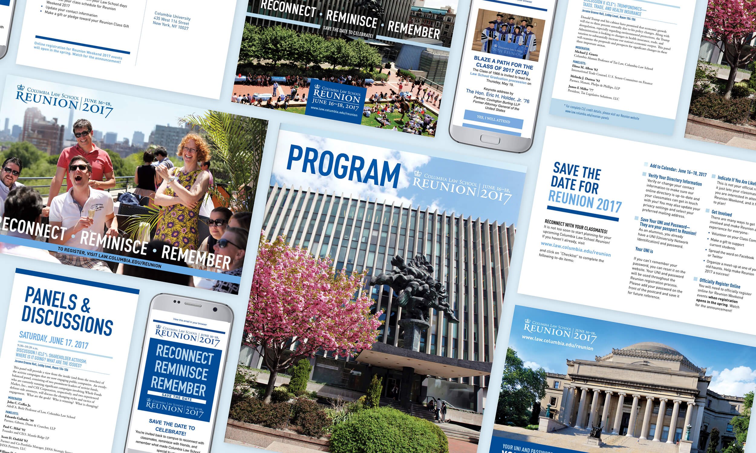
Although Columbia Law School was founded in the 19th century, it didn’t need its reunion branding to feel that way. I rearranged the logo lockup for a more cohesive and clear hierarchy that scales well to the various print and digital communications of the modern era. Also, after years of text-heavy design, I capitalized on Columbia’s rich event photography to break up and humanize the content with its bright colors and smiling faces.

Save the date
Since each reunion hosts alumni from five years out of school to 70 years, marketing materials and event collateral spanned both digital and print materials for accessibility. The large text and bright blues distinguish the reminders from other legal communications, while animated graphics help increase time spent reading and modernize the email.
Event weekend
The legal world is fast paced and the alumni reunion weekend was meant to slow down, network, and learn. Conveying that visually, I used large typography to immediately indicate hierarchy and maximized white space with an unconventional grid thereby giving the events a playful space to breathe. Since the weekend included several Continuing Legal Education credit programs, I pulled them out into a Panels & Discussions card so that people could easily access their coursework as well as mark their page in the program.


