Take a walk on the mild side
Client
Do Drops
Studio
Humankind Studio
My role
Art direction
Web design
UX/UI
Branding
Packaging
Photo editing
Project management
Many people associate edibles with a bad personal encounter likely due to misunderstanding the product and overconsumption. Do Drops understands and offers a 2.5mg low-dose edible to allow consumers to better manage their experience.
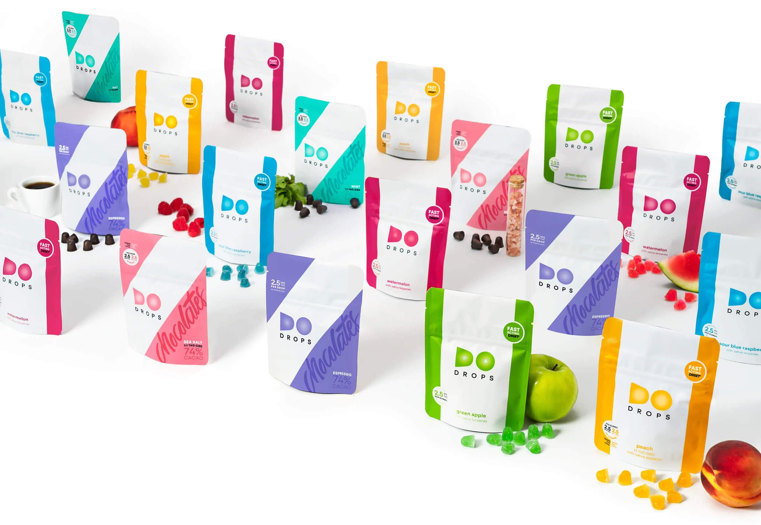
As market demand for edibles grew, Do Drops expanded in availability and product offering. Keeping in mind that consumers, budtenders, and dispensary managers may all visit the website for different reasons, I refreshed it to include educational resources and infused it with updated branding, including a bold personality and recently redesigned packaging.

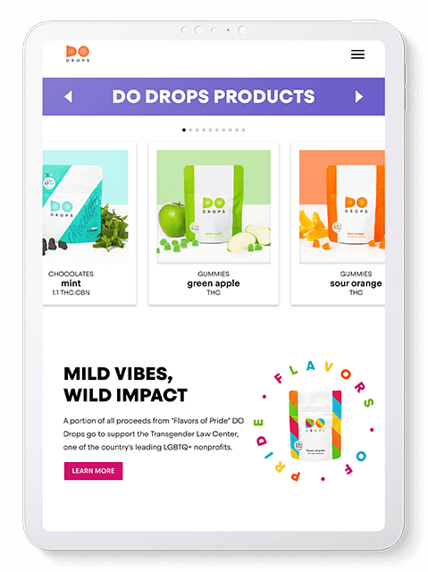
Since the flavors are crucial to driving sales, I created multiple ways to explore their individual pages. Beyond the primary and secondary text navigations, an ingredient-forward all-product slider on each flavor page helps people connect visuals with what they’ll taste. Meanwhile, the nearby vibrant colors also entice them to explore another flavor.
In order to engage people and encourage them to stay on the site, I added interactive elements that show off the product and branding. While text animations and rollover states are now standard, this scroll-triggered home page animation is a unique marketing opportunity to visualize how microdosing works.
Each flavor page was curated with product galleries that act as snapshots and creative showcases of possibility. This strategy keeps the flavors fresh and also allowed Do Drops to repurpose the images in social media and marketing. I also incorporated puns of the words mild and wild in the page titles to reinforce the brand’s playful spirit.


